Thursday, 26 January 2012

NO SWEAT BRANDING

Finally got my look book printed, have to say it's my baba at the moment! Here is a small sample of the pages, these focus on Tunisian design and designers.
Ignore all the dodgy backgrounds in the photos, I'll sort them out for my self promotion brief at some point...

To see the presentation boards and to read more about this brief, just scroll down ↓


Presentation boards


We had a choice of a selection of briefs, all specialising in something different, such as branding, illustration and info graphics. I was well excited when I saw I could have the chance at having a go at some fashion branding, as this is the kind of career I'd love to pursue. This brief was to completely re brand a fair trade clothes company, called No Sweat. Through my research I soon got fed up of seeing everything on brown paper and handwritten, purely because it was 'fair trade.' I also discovered that fashion designers and worshippers in Africa feel that their traditional designs, such as Ankara have been pretty much exploited. Just from reading through lots of their blogs it seems that they feel the Western world pigeon hole African design as animal print and tribal print. This created my idea behind the brand. Why can't African designers be given a chance to show the rest of the world what they have got? This created my brand's name PODIUM. I wanted to use the brand as a platform for aspiring African designers.

I designed a look book, that not only promotes the scarves the designers have designed (see presentation boards for more information about the brand concept and values), but to show the inspiration used from traditional design, and a double page focus on 2 designers from each country I concentrated on. 

The complete look book is 48 pages long, however I'm not putting it all on here! So here is the first few pages, the first section focusing on Tunisian design, and the last pages. In between these are the other sections focusing on Uganda, Nigeria and South Africa, all in the same format but with their own colour palette.


Monday, 12 December 2011

BRAND IT & PACKAGE IT


Final logo in colour & black and white
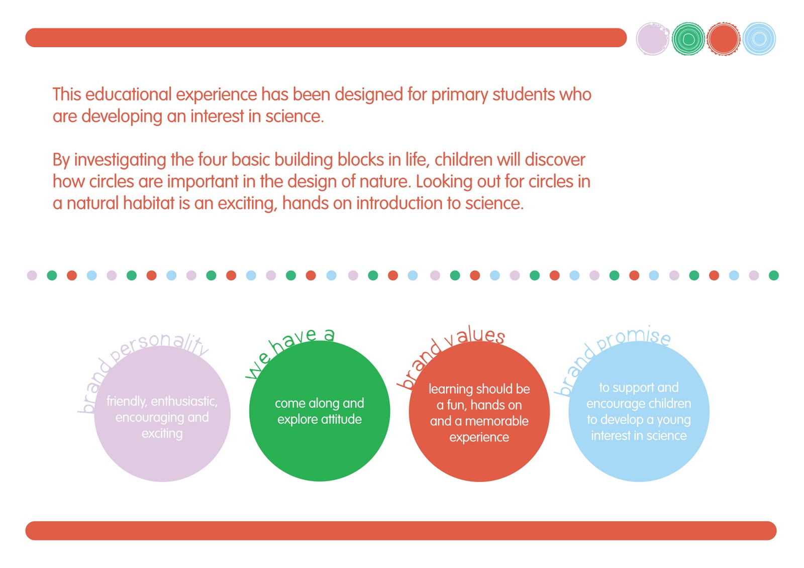
Early brand ideas board & brand concept/values presentation board
Homepage & children's pages layouts on the 'four' website
 Parent's & teacher's homepage and webpage layouts

At the beginning of this project we had to pick from a selection of random words. I chose immortality. We then had to create a complete brand based around our chosen words. Pretty early on into the project I realised I could do something with numbers and science, as they are infinite. After a couple of tutorials my brand was established. I created the idea that the basic building blocks in life, the 4 elements, are immortal. I also realised that the circle (a symbol for immortality) is present in many of these elements. This created my brand concept that 'elements are immortal, and circles symbolise the continuity of the elements.' I turned my brand into an exciting learning experience for primary school children, where they'd learn about the natural environment by exploring and hunting for circles. To package my brand, I created an interactive website to provide information for parents and teachers, and also simple yet fun learning pages for children, to provide a small taster of what my brand and experience is about.


(Over Christmas my aim is to make this a working website, so then I can show off my moving images which took forever to make. Watch this spaceee...)

W*NKER OR GENIUS?


Left - images Marilyn wanted destroyed of herself from the shoot.
Bert Stern, The Last Sitting, 1962
I've always admired Marilyn Monroe's glamour and confidence. She is definitely as much as an icon now as she was in her heyday. For my first project of year 2, we had to pick a celebrity and create something that would prove your point of view...are they a wanker, or a genius? Obviously I would never consider Maz as a wanker. However, I was surprised by some things within my research. I never knew she came from a broken home and was never loved by her Mother. I also didn't realise that she had many miscarriages. I guess I never knew these things because she always looked on top of the world and effortlessly glamorous in all of her photos. That is what inspired my project. I have created a vintage photo album/diary, keeping a personal track of her life in the public eye. One side of the photograph is untouched, whereas on the reverse side the same image is falling apart. As the pages turn each reverse image becomes more distorted until her death. This is the first project where I haven't touched the computer, and I loved every second of it. I wanted this album to represent Marilyn as a genius, because even though she was falling apart inside, she always kept it together for anybody who liked her. 


reversed view
reversed view
reversed view
reversed view
reversed view
reversed view

10/2011